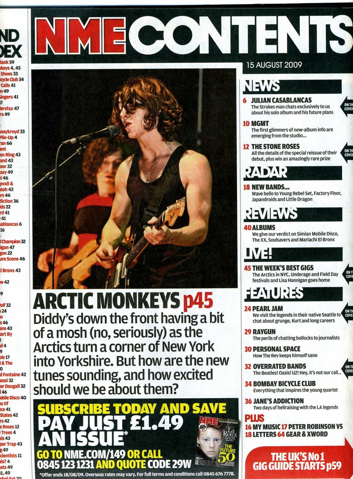
I have chosen to deconstruct this NME contents. The first thing that my attention is drew to the masthead. This is because It's a lot larger than any of the other writing and also a bolder font is used. also the red for the name of the magazine makes it stand out more this an element most music magazines use. Unlike the other 2 magazines this one does not feature a logo, this may because the masthead is easily recognisable so there would be no need for a logo, as they don't need to keep reminding the audience of the magazine. The layout of this contents page is organised well as everything is easily navigated for example the different features of the magazine eg 'news' 'radar' etc... Are all in a different colour with a black box so it stands out and instantly your eyes are drawn to it. The colour use is still minimal which helps with the organised feel of it which is something I will use when creating my magazine. This contents features one main image at the top of the page which is a main convention. However most magazines contain more than one image on the contents page and this magazine does not. I think the layout looks more professional if you use atleast two photos so the audience can visually see who they will be reading about in this magazine. The page numbers for this magazine are in a different colour so it's easy to find, I like the idea of this being easily to navigate so I'm going to try to use this. Finally, this magazine uses a convention most magazines don't have. It makes the audience be interested by stating if they subscribe, they can get the magazine for less. A drop in the price will get more customers.
Thursday, 18 December 2014
Contents page deconstruction 2/3
I have chosen to deconstruct this Q contents page. The first thing that grabs my attention is like the other magazine the grey chart down list at the left hand side. This has on purposely been made to stand out in a different colour, which suggests this is an important feature to the magazine, so therefore I should try to use it. Both magazines I have looked at contain this so this is a main convention of a music magazine. This magazine also features a logo, which is placed in the left hand corner. The logo is very recognisable, and some buy it just for the brand so the logo being there makes it a bigger selling point. The masthead of this magazine is "CONTENTS" sticking to main convention. The layout of this is page comes across as very well structured as the large image evens out the heavy bulk of words, the large image again is the main artist who headlines in this magazine. The page number for the main artist is very easily to navigate, as this will be one of the main selling points for this magazine. The difference with this magazine is the fonts of the page change, this is something I don't prefer I think if the fonts are kept the same it allows the page to look more presentable and structured. However, I like how the mastheads are in a different colour eg white and the writing is white so they contrast each other, and the masthead stands out. This contents sticks to a minimal colour palette of just black, white and red, in comparison to the other magazine I prefer the lack of colour as too much colour can give the magazine a more tacky feel making it less professional. Also, with the colours used the audience can easily recognise this is 'Q' magazine as these are their signature colours. Another feature of this Q magazine is the fact they have a music guide on the right hand side. As the audiences are all music fans this is a good feature to include, as I believe it would attract more people. Finally, this contents page also includes their website which is a convention I will definitely use. The younger generation love technology and as Q attract an teenage audience, the website would interest a large percentage of the audience.
Contents page deconstructions 1/3
I have chosen to deconstruct a Billboard contents page. The first thing i noticed about this page was the chart list down the left hand side. This has been made separate to the rest of the page . This suggests that this is an element which appears in multiple music magazines and then should be something I should try and use. As well as this, the use of this chart list would inform the reader about how well artists and bands are doing and may draw their attention to an album they have not yet hear which could later make the audience buy them.This magazine features the logo of the magazine but very small and it is not included in the masthead of the page. This may be because the masthead was easily recognisable on the front page and they don't need to keep reminding the audience. Therefore, the masthead of this contents page is simply 'CONTENTS'. This is simple yet effective as it is in large writing and so would stand out to the audience. It is also clear that the font used for the masthead and subheadings such as 'NO.1' 'CONTENTS' and 'HOME FRONT' is the same through the whole magazine which creates a sense of structure and organisation. Even though the fonts are the same, the masthead is in black where as the other two are in white. This causes the masthead to stand out from the rest of the text.This is a colourful contents but it is able to remain organised as these colours are also featured in the logo of the magazine. So therefore they stick to he same colours. This makes the page aesthetically pleasing and appeals to its audience. This magazine features a few images at the very top of the page, under the masthead. As this appears to be a typical convention of a music magazine this should be something i think about when making my own magazine. also, all of these images are the same size and the same distance apart which makes the page more organised. The main image is the main artist that the story will be wrote about. All of the page numbers are the same size despite even though the font isn't. The choice of colour is very simple (black and white) but they contrast well, so therefore look good together. Another feature which this Billboard contents page has is the fact that the contents are split up into various categories (Upfront, Features, Music & In Every Issue). This is a convention which I will definitely consider including in my own magazine to allow it to look professional.Finally, this contents page has a featurewhich some magazines don't which is the fact that it advertises their website at the bottom. As the Internet is becoming an increasing part of everyone's daily lives, particularly the young audience of Billboard magazine, I believe this is a good feature to include. They have stated various different things you can find online such as exclusives and touring and even included a direct link to this page rather than just the website.
Wednesday, 17 December 2014
Photographs
This is my chosen photo for my front cover I think this picture shows what I want my magazine to come across as. The guitar, facial feature, make up and hand signal gives it a punk feel and this links to the audience I'm aiming my magazine at.
Wednesday, 3 December 2014
contents page so far
after messing on with background i have decided on this black gradient background. I have decided on my feautures bar containing the contents of my magazine and one large image of my band that will be on the front cover. The colour pallette of black and red shows my punk theme, so this is the colour theme which will follow throughout the whole magazine. I have decided on the black C with a red background being my logo as the magazine will be called "clash".
Tuesday, 2 December 2014
Location Reece
LOCATION RECCE
Are there any potential hazards that could pose a health and safety risk where your photo shoot will take place (trailing cables/traffic/other objects)?
As my photo are being taken in the studio there is a possibility that my model could trip over cables as the lights wires will be trailing on the floor or even other students bags, these are trip hazards.
What will you do to ensure these risks are minimised?
Before starting the shoot I will ensure all bags wires are tucked away to ensure there are no hazards.
Will the time of day/weather affect the outcome of photos? Have you allowed for this?
The light will affect the outcome of these photos as I need to make sure the front cover is kept bright and colour, where as the contents need to be dark and gloomy to match the genre. I won't be taken photos outdoors so the weather won't affect the outcome of my photos.
Have you considered the background to your photos, particularly if taken outside? How will you ensure you will get the background you want?
I want my front cover image to have a plain white background so the model stands out. When I put my photos on Photoshop I might change my mind to a dark background such as black, as white may be too bright and happy for my genre.
Have you considered lightening? What about the problems of natural lighting, either outside, or streaming through a window? Will you need to use a flash? Have you considered reflective objects that might spoil the effect?
As I want my photos done in the studio natural light won't be a problem as I will turn the lights off and use the cameras flash. There are no objects in the studio that would spoil the effect as long as I make sure he turn the lights out.
Do you need permission to take photos in a place/venue you have in mind?
I need permission to use colleges facilities, as my photos will be taken in the studio, as I believe this will be the best outcome.
Do you need to book time in a room?
I will need to book time in colleges studio
Are other people/crowds likely to be an issue for you? What have you done to ensure that it will not spoil the effects?
People will not be an issure for my aslong as I ensure I book the studio, and the times aren't over lapped.
are you reliant on lifts/props/friend'sequipment/models? How have you planned that these things will come together at the appointed time? Plan B?
I am reliant on my model who hopefully will turn up as planned, I have made sure to chose close friends so they don't let me down. If they don't turn up my plan B is I have college friends who would be willing to help me out. I have bought the equipment myself so therefore I'm not having to rely on other people.
Wednesday, 26 November 2014
Double page spread final plan
I have changed my double page spread to this, as the set up i chose orginally didn't look like an actal magazine
Contents page final flatplan
I have made a flatplan for my contents page, i changed it as my orignal plan didn't have the set out for a contents page. I have decided on two images where the boxes with the crosses are. The text boxes below or in the image boxes will be a caption explaining the image. The rest are text boxes. The rectangle at the top will be the title 'contents'. the thin rectagle to the left will show the contents of the magazine with what page number it will be on. the box below that will a short message from the editor.
Friday, 14 November 2014
double page spread deconstructions
From doing this research I more confident on how my double page spread will look i will include
-A pull quote in the middle of the text to break up the writting and so it looks more visually appealing
-A strapline to draw in my audience to read my arcticle
-3/4 columns of writting so its not too much
-I will stick to a minmal colour palete, 3 colours asit looks more professonal
-One dominant image
-A drop cap to break up the paragraphs, and for visual appeal
INDESIGN PRACTISE
I used indesign to create this poster to advertise a raffle for children in need. I did this to experiment on adding images and text and changing fonts and color etc.
Wednesday, 5 November 2014
preliminary task
For my actual magazine I need to make improvements such as text needs to stand out so possibly make the text a more contrasting colour and bold. My biggest change will be that my magazine won't be made on publisher, i will use photoshop for a more professonal look. My coverines are too long this would lose the audiences attention so it needs to be shorter and more snappy. My writting is all written in the same font, i should try to use a variety to improve it. My photos need to be less stretched and at a better quality at they are blurry. I need more content on my contents page, as there isn't enough information.
Friday, 24 October 2014
Friday, 17 October 2014
Wednesday, 15 October 2014
Photoshop skills development
To create this firsty i tried to neatly cut around the image of Bob Dylan with the eraser tool which i came to the conclusion, it is uneffective as it isn't neat. so to make the edges neat i used the quick selection tool and made sure it went around the outline of him neatly. Then to make him stand out i changed the background colour, by using the rectangle tool and making the image of Bob Dylan the top layer. Last of all i used the text tool to apply my masthead, then again making Bob Dylan the top layer so his hair sligtly covers the bottom of the text.
first of all the create this i had to cut around the image with the quick selection tool. Then to make the edges more neat i used refle edge and messed around with the tools such as contrast and smart radius until the edges where neat enough. I came to the conclusion for my image the correct smoothness was 8 and the contrast was 85. To then make the background colour i selected the rectangle tool, chose my colour and drew a box as big as the page. The make the image come back to the front i had to make sure i dragged it to the top layer. I then used the text to create my masthead and subheadings.
Friday, 10 October 2014
magazine cover deconstructions
I have completed my magazine cover deconstructions on powerpoint then i uploaded the slide to slideshare.
Wednesday, 8 October 2014
flat plan of main magazine
I placed the masthead at the central at the top of cover as this is the first place people look when picking up a magazine, so straight away your eyes are drawn to the large bold central masthead. My main image covers the whole page so the bright colours catch the readers attention even if they aren't looking for the magazine. I placed the main coverline over the image so you can see how it links to the image as it's close to it. The main coverline will be the next bit that stands out after the image so you understand what the magazine will contain.I have made this the biggest text, as it is the main story so it is more important than the rest of the text. I have placed a subheading under the main cover line to further explain the cover line, but in a smaller font,so they'll only read it if the coverline interests them. I have placed other coverlines on the opposite side of the magazine, with different stories on as people may not be interested by the main coverline. I also included a website for futher information on other magazines, if people enjoyed this magazine. And lastly i included a barcode so the magazine can be bought at the til.
For my contents page i still included a masthead, where the words contents in a large bold font would be placed. The central posistion at the top of the page makes sure that's the first thing the audince will see, and read. i will still continue with my minimal colour scheme, so it stands out but isn't too bright. I will include a relevent large image at the bottom of the page so not only will the masthead at the top draw attention, but the bottom of the page still will. The caption will explain the picture furthermore. Down the left hand side, i will state which story will be on each page, so that the reader can find the sotries that interest them quick and easy, without having to check through the whole magazine. i also included a short story from the editor explaining what will be in the magazine this month to entice the readers furthermore.Friday, 3 October 2014
Cover Deconstruction
Masthead- It's the title of the magazine, it's placed at the top of the page so that's the first thing you see. Fans that buy that magazine weekly will recognise it as it always stays the same.
Sell line- It's a short sentence telling readers what else the magazine will contain. It's usually the main story within the magazine, so will link to the image of the celebrity. It won't give away too much as it wants to draw in the audiences attention, and tease them to want to read more.
Bubble- Way of highlighting something that's nothing to do with the image. This can include a competition
Main image- This is a giant image of a person, a well known celebrity. Whoever it is will link to the sell line. It builds an identity for the magazine as people will recognise the person or people on the front cover
Subheading- It explains the sell line further in a little more detail, but not too much as they still want to tease the audience so they will be enticed to buy it
Barcode- It's used to sell the magazine at the counter, usually the price is place just beside the barcode too in a small font, so the price doesn't put off the audience
Friday, 26 September 2014
Foundation Portfolio Print Brief
Preliminary exercise: using DTP and an image manipulation program, produce the front page of a new school/college magazine, featuring a photograph of a student in medium close-up plus some appropriately laid-out text and a masthead. Additionally you must produce a mock-up of the layout of the contents page to demonstrate your grasp of DTP.
Main task: the front page, contents and double page spread of a new music magazine (if done as a group task, each member of the group must produce an individual edition of the magazine, following the same house style).
Subscribe to:
Posts (Atom)


